Eyeglass Administration guides Publication
The Charts
Home
The Charts
Prerequisites
- RPO target configured for each cluster managed by Eyeglass.
- PowerScale RPO Feature License.
SyncIQ Job RPO Chart
The Eyeglass Job Duration Chart plots the Maximum Age of Un-replicated Data per SyncIQ Job successfully run in minutes over time, and on the same chart, the Job Duration for each SyncIQ Job run. Up to 6 SyncIQ Policies can be selected to be graphed on the same chart.
To generate the Data Transfer Chart:
- Login to the Eyeglass web page.
- Open the DR Dashboard.
- Select the checkbox for the policy of interest.
- For a multi-Job chart, up to 5 additional policies can be selected.
- Select the Generate SyncIQ Job Charts button.
- Select the From and To date and time in the Report Time Range Setting window.
- Select the Launch SynciQ Job RPO Chart button.
- The SyncIQ Job RPO Chart opens.
- Maximum age of Unreplicated Data plotted in minutes corresponding to each SyncIQ Job successfully executed (diamond marker).
- Job Duration plotted in minutes corresponding to each SyncIQ Job successfully executed (circle marker).
- Each policy plotted in a different color.
- Mouse over a data point to see the details.
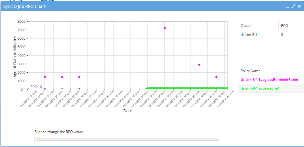
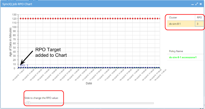
- Select a cluster on the right-hand table to add the RPO target for that cluster to the graph. Points above the RPO target have not met the target and are displayed in red. You can use the RPO slider at the bottom of the chart to see the effect of changing RPO target.
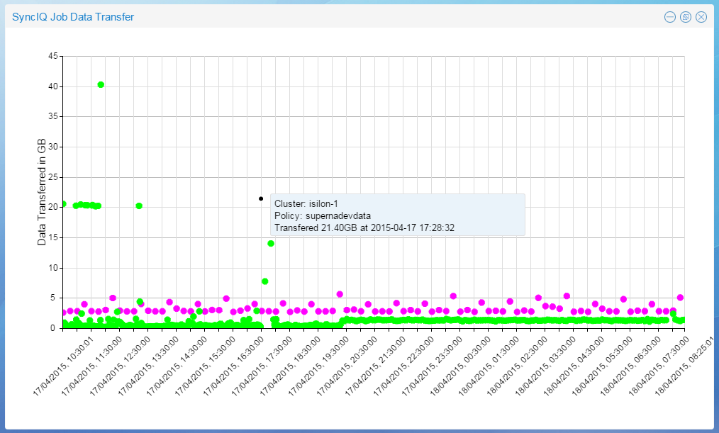
Data Transfer Chart
The Eyeglass Data Transfer Chart plots the total amount of data replicated per SyncIQ Job successfully run in GB over time. Up to 6 SyncIQ Policies can be selected to be graphed on the same chart.
To generate the Data Transfer Chart:
- Login to the Eyeglass web page.
- Open the DR Dashboard.
- Select the checkbox for the policy of interest.
- For a multi-Job chart, up to 5 additional policies can be selected.
- Select the Generate SyncIQ Job Charts button.
- Select the From and To date and time in the Report Time Range Setting window.
- Select the Launch SyncIQ Job Data Transfer Chart button.
- The SyncIQ Job Data Transfer chart opens.
- Total data transferred is plotted in GB for each job executed for the selected policies in the selected time period.
- Each policy plotted in a different color.
- Mouse over a data point to see the details.