Charts Uses:
Am I Meeting my RPO Business Target on my PowerScale Cluster?
Use the Eyeglass daily RPO compliance email to quickly and easily gain a view of whether or not you are meeting your business targets. For each cluster that Eyeglass is managing, you will receive an email comparing the last 24 hours to the last 30 days. To get the details you can use the Eyeglass graphs to find out why RPO times might be increasing outside your targets.
The summary report provides the percent of SyncIQ jobs that failed to meet the objectives, and which provides a quick summary of your targets per cluster.
Are my SyncIQ Policies Performing as Expected?
Use the Eyeglass daily email to quickly and easily gain a view of whether your SyncIQ Policies are performing as expected. The SyncIQ Jobs Troubleshooting section will highlight by cluster:
- Which SyncIQ Policies did not run that should have run in the last 24 hours.
- Which SyncIQ Policies had jobs where the transfer rate was lower than the policy average rate over the last 30 days.
- Which SyncIQ Policies had jobs where the interval is greater than the policy average interval over the last 30 days.
How far back can I Recover my Business Data?
Use the Eyeglass Job Duration Chart to analyze the maximum age of your data per SyncIQ policy over a selected time period. The maximum age number is calculated based on the last time the data was successfully replicated to the remote cluster, plus the time it would take to replicate the same amount of data.
This chart can be customized:
- Start and end date and time.
- 1 to 6 SyncIQ policies on the same graph.
- Moving the RPO scale to show which days and time the SyncIQ data “Age” exceeded your cluster target. This is shown as red dots above the dotted line.
- To ensure 100% of all change rate data is below your target, and to understand your worst-case RPO value within the time period, slide the RPO slider to the right until no Red plots exist. This value is now the worst-case data age exposure.
How Much Bandwidth is Used and When is it Used?
Use the Eyeglass Job Data Transfer Chart to analyze the maximum age of your data per SyncIQ policy over a selected time period. This chart can be customized:
- Start and end date and time.
- 1 to 6 SyncIQ policies on the same graph.
How to Use the Average Data Transfer Rate Analysis?
This provides an overall view of the average WAN rate, in Mbps, that is required to maintain the RPO in the reports. If the goal is to lower the RPO, this number can be used to provide the WAN or network team input on the current network load required to meet current RPO levels.
Network QOS or SyncIQ threads per node can be verified to increase network throughput, and use this report summary to track improvements in WAN throughput.
Per SyncIQ and Cluster Wide Graph and Data Examples
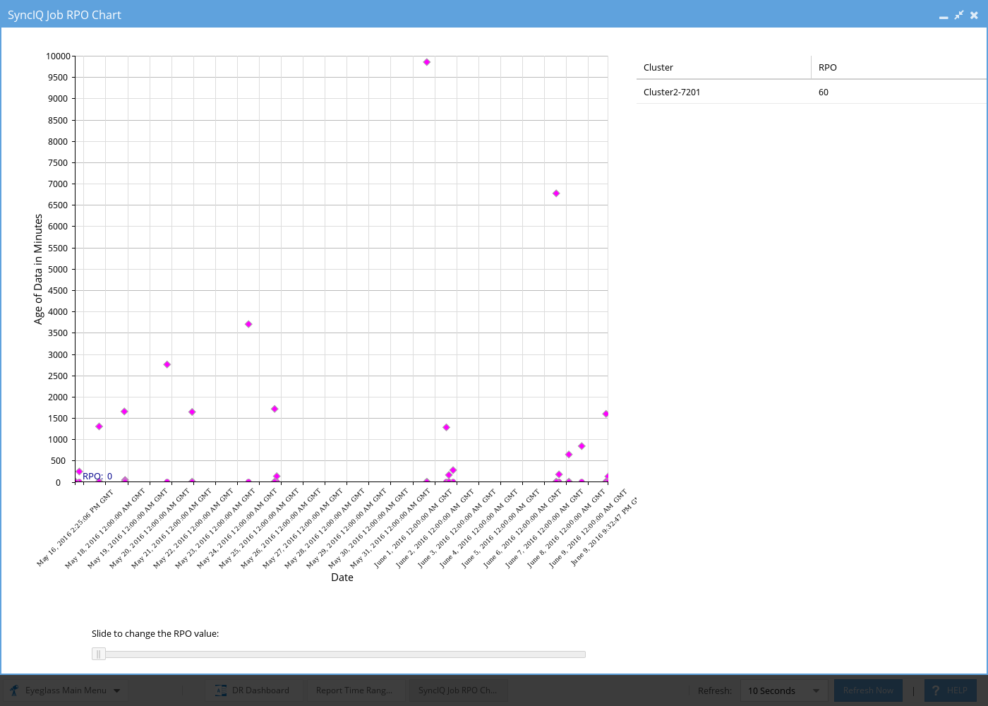
Example #1 of 30 day Per SyncIQ graph
Note: File name is the name of the SyncIQ policy.png
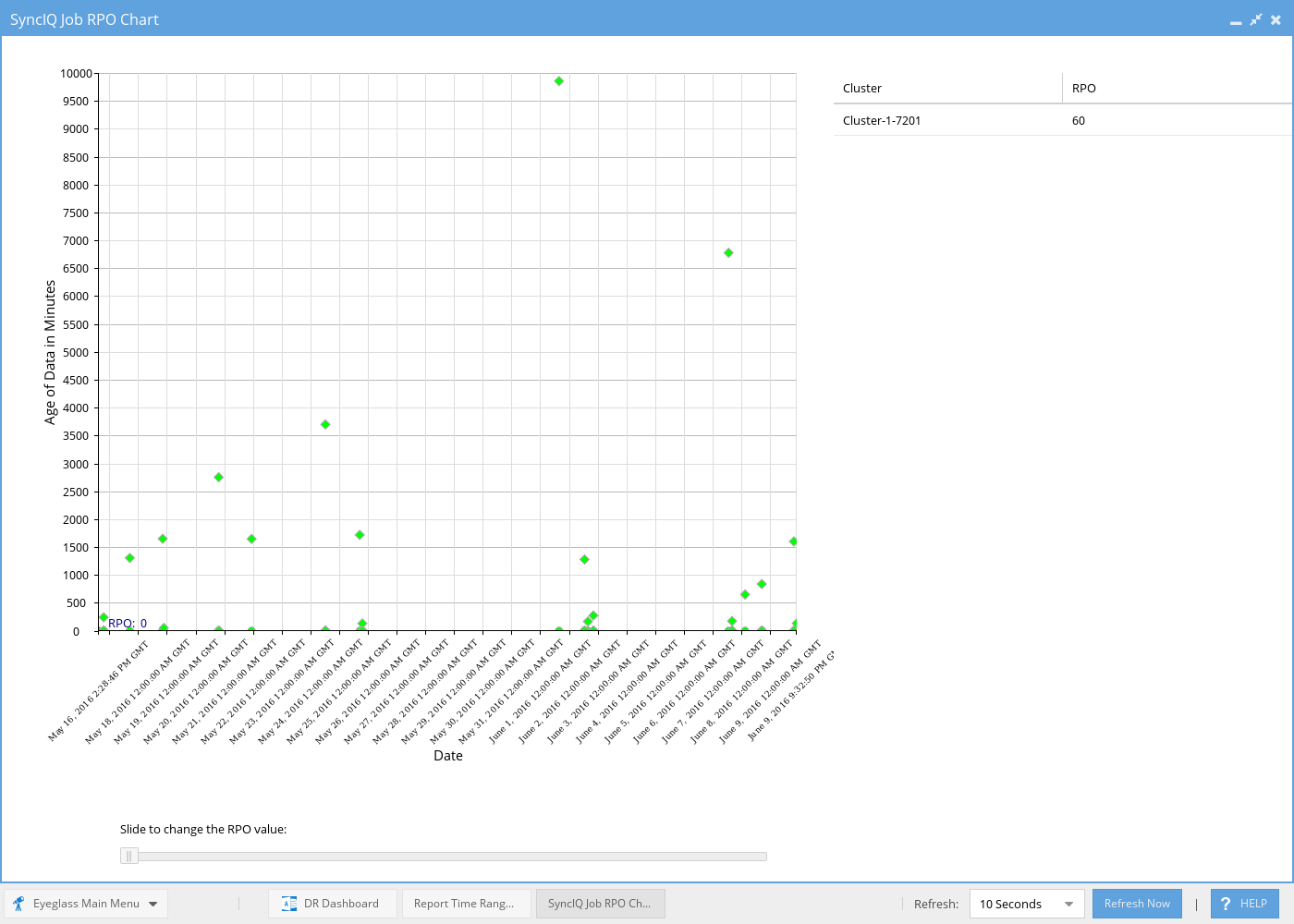
Example #2 of 30 day Per SyncIQ graph
Note: File name is the name of the SyncIQ policy.png
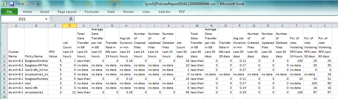
Example Cluster Wide RPO CSV file data
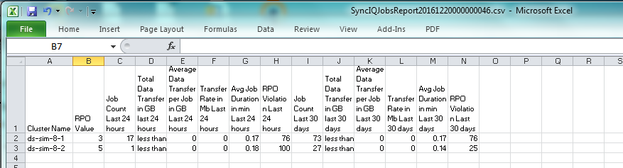
Example Per SyncIQ RPO CSV file data